Introduction
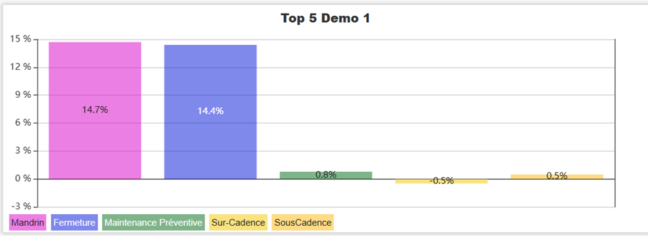
The Loss Pareto KPI displays, in real time on your dashboard, a bar chart representing the breakdown of a PerfTrak machine's losses over a defined interval. Each loss type is identifiable through the colour code configured in the loss tree, and the values can be displayed as a percentage of the total time or as a duration. This KPI makes it easy to spot the most impactful losses and prioritise improvement actions.
Example use cases
Identifying the main losses of the shift — A team leader configures a Pareto on the current shift to immediately identify the two or three loss categories that cost the most time, and to direct corrective actions.
Weekly Pareto analysis — A methods engineer configures the KPI over the last 7 days with loss level 2, to obtain a detailed Pareto of root causes and feed a continuous improvement meeting.
Comparing occurrences against duration — A maintenance manager enables the "Display occurrences?" option to compare how often each loss appears with its total duration: a frequent but short loss and a rare but long one do not call for the same actions.
Macro view by loss family — A production director selects level 0 to obtain a summary view by major family (Availability, Performance, Quality, and so on) before drilling down to level 1 or 2.
Creating and configuring a Loss Pareto KPI
Step 1 — Create the KPI
Go to your dashboard.
Click Add New KPI, then select PERFTRAK machine as the machine type and Loss Pareto as the KPI type.
Step 2 — General settings
| Field | Required | Description |
|---|---|---|
| Name | Yes | Free name for the KPI, displayed above the chart (e.g. "Pareto last 24 hours") |
| Machine | Yes | A PerfTrak machine within your perimeter |
| Interval | Yes | Time window the Pareto is calculated over |
Step 3 — Select the loss groups
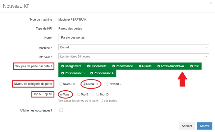
The default loss groups define which level 0 loss categories are taken into account in the Pareto.
- The groups shown in green are included.
- The greyed-out groups are excluded.
Click a group to include or exclude it.
Step 4 — Set the level and the number of losses displayed
| Option | Description |
|---|---|
| Loss category level | Choose the level of detail: Level 0, Level 1 or Level 2 (detailed causes) |
| Top 5 / Top 10 / All | Limits the number of loss categories shown on the chart |
Step 5 — Choose the display type
| Mode | Description |
|---|---|
| Percentage | Each bar shows the loss as a percentage of the total production time |
| Duration | Each bar shows the absolute duration of the loss over the interval |
Step 6 — Display the occurrences (optional)
By ticking the "Display occurrences?" box, a line representing the number of times each loss occurred is overlaid on the bar chart. This lets you visually compare how frequent a loss is with its impact in time (or percentage).
Step 7 — Save
Click Save. The KPI appears immediately on your dashboard and updates in real time.
Reading the KPI
The KPI is displayed as a vertical bar chart:
| Element | Description |
|---|---|
| Horizontal axis | Loss categories, sorted by decreasing impact |
| Vertical axis | Percentage of the total time, or duration, depending on the display mode chosen |
| Bars | One bar per loss category, coloured according to the loss tree colour code |
| Value on the bar | Percentage or duration of the loss |
| Legend | At the bottom of the chart, a reminder of the categories with their colour |
| Occurrence line | Number of times each loss occurred (visible only if the option is enabled) |
💡 Some "Overclock" losses may appear with a negative value, indicating time gained compared with the theoretical rate.
Edge cases and points to watch
Machine outside your perimeter. Only the PerfTrak machines included in your perimeter are offered for selection. If a machine is missing, contact your administrator to check your access rights.
No data over the selected interval. If no loss was recorded over the chosen period, the chart appears empty. Check that the interval suits the machine's production rhythm.
Negative values. "Overclock" losses represent time gained compared with the theoretical rate. They appear as bars below the 0% axis, which is normal behaviour.
Readability with the "All" option. On machines with many loss categories, the "All" option can produce a dense chart. Prefer "Top 5" or "Top 10" for quicker reading.
Loss colours. The bar colours match those configured in your project's loss tree. They cannot be set at KPI level.
Deleting a dashboard. Deleting an account (manager or administrator) deletes the dashboards associated with it, including the KPIs they contain.
FAQ
Can I create several Loss Pareto KPIs for the same machine? Yes. You can for instance create a percentage Pareto at level 0 for a macro view and a duration Pareto at level 2 in top 5 for detailed analysis, on the same machine.
Does the KPI show history? No. The Loss Pareto KPI is a real-time visual. It displays the data calculated over the current interval.
Can I share this KPI with other users? The KPI is visible on the dashboard. Any user who has the machine in their perimeter and access to the dashboard will be able to see it.
How often is it updated? The KPI refreshes automatically, in real time, with the data sent by the machine.
What is the difference between the Loss Pareto and the Pie Chart? The Pareto displays losses as bars sorted by decreasing impact, which makes the major losses easy to identify. The Pie Chart displays the breakdown of losses as a proportion of the total time, including normal operating time, for an overall view of performance.